


 The "A.B." in ABCreations stands for Anmarie Bowden, that's me! My favorite ice cream is Mississippi Mud from Baskin Robbins, altho I'm partial to Oreos crumbled on top of Vanilla Bean ice cream too! I was born on Super Bowl Sunday. I have been digiscraping since 2000. I live in beautiful sunny California. I am married to my soul mate and we have two gorgeous children. My favorite saying is, “If you think my hands are full, you should see my heart!”

February's Question: When creating a layout, should I just use whatever colors are in my photos? How many colors is too many and how many is not enough?
February's Answer: For each page, you need, at a minimum, one background color, a bright accent, and a third color that works with both. Choosing colors is easy for some people but difficult for others. I can look at a piece of khaki-colored paper and know immediately that it will look quite good with a bright turquoise and a related shade of cream. Or I could take a deep cranberry red to combine it with a pale pink and a warm grey, and have a very different-looking page, even though the layout might be exactly the same.
Warm gray? Yes, colors have temperatures. Reds, yellows, oranges, and even browns, are all warm colors. If you were doing a page about a day at the beach, you might want to try mixing red, yellow, and orange to stress the heat of the sun and sand. Cool colors, like blues, greens, and violet tones, suggest cooler temperatures; perhaps cool water or leafy forest leaves. Warm greys have a touch of one of the warm colors in them. Cool greys include some blue or purple to cool them off. In-between is neutral gray, which doesn't lean toward either warm or cool.
Colors also have moods and even cultural associations attached to them. Hot colors are bright, bold, and jazzy. Cool colors are restful and calming. Some colors are associated with particular holidays, and some with moods or places. For instance, purple and yellow together always make me think of Easter. Red and green suggest Christmas. Blue and white suggest Hanukkah. One good way to experiment with color schemes is to drop by your local Lowe's or Home Depot or other store with a large paint department. Grab a handful of those color chip strips. Go for a broad color range from pastels to brights. When you get home, cut them into single colors and then just move them around on a piece of white paper until you find color combinations that please you, or that remind you of moods or places that suggests photos you want to use in your layout.

Many avid scrapbookers keep a color wheel to refer to. Colors on the color wheel are divided into three categories, primary, secondary, and tertiary. The primaries are red, blue, and yellow. These are the pure colors. Secondary colors are an equal mix of two adjacent primaries. Red and blue make purple. Red and yellow make orange. Blue and yellow make green. It's fair to say that any combination of a primary color and a related secondary color, light blue with purple or blue with green, harmonize nicely.
Tertiaries are the colors that would be wedged in between the adjacent primary and secondary. For example, blue green and blue violet. They harmonize with the colors that make them so you can happily combined turquoise blue and lime green, because they have green in common, or dark blue and any shade of violet because they have blue in common.
Complementary colors are the ones that are opposite each other on the color wheel, like red and green, blue and orange, and so on. They can also work as combinations, either in their bright forms, or happily as pastels. Red and green can be an effective combination, but can come on too strong for some uses. Instead, think pink and pale mint green. Remember there's more to color than just the color. There are tints and shades and differences in brightness. Think of mixing white with a color to reduce the amount of pure color, giving you a pastel. Mix black and gray with a bright color to darken it or mute it. Grayed colors are particularly effective with a country or victorian look.
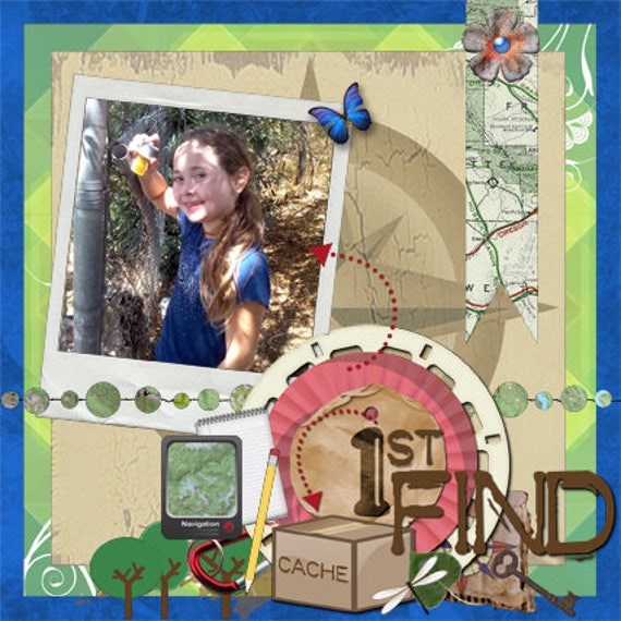
If your photos are in color, make sure that the colors you choose for your pages are similar to the colors in the photo. For instance, suppose you have a picture of your daughter finding her first geocache. She is wearing blue and is outside in the summer time where there is some green shrubbery but mostly brown grasses. Try using blue, green, and brown for your color scheme, but add a bit of red to really make the page pop! Sounds rather strange, but it works nicely!
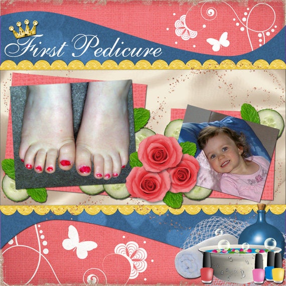
Now that you've done some thinking about your scrapbook layouts, you can start putting together a page. Ask yourself: what's the page about? what are the colors in the photo? is there a theme that will help you choose stickers and other embellishments? what could a possible title be? Let's say you have a photo of your daughter's first pedicure. She is wearing a top with pink roses, the background is blue and beige, and her cute little toes are pink. Try using muted shades of the pink, blue and beige, plus an accent of green to really make things shine!
Good luck and remember to have fun!


No comments:
Post a Comment