~ ♥ ~ ♥ ~ ♥ ~ ♥ ~ ♥ ~ ♥ ~ ♥ ~ ♥ ~ ♥ ~ ♥ ~ ♥ ~ ♥ ~ ♥ ~ ♥ ~ ♥ ~ ♥ ~ ♥ ~ ♥ ~ ♥ ~ ♥ ~ ♥ ~ ♥ ~ ♥ ~ ♥ ~ ♥ ~ ♥ ~ ♥ ~ ♥ ~ ♥ ~ ♥ ~ ♥ ~ ♥ ~ ♥ ~ ♥ ~ ♥ ~ ♥ ~ ♥ ~ ♥ ~ ♥ ~ ♥ ~
New Goodies on Sale HERE!
~ ♥ ~ ♥ ~ ♥ ~ ♥ ~ ♥ ~ ♥ ~ ♥ ~ ♥ ~ ♥ ~ ♥ ~ ♥ ~ ♥ ~ ♥ ~ ♥ ~ ♥ ~ ♥ ~ ♥ ~ ♥ ~ ♥ ~ ♥ ~ ♥ ~ ♥ ~ ♥ ~ ♥ ~ ♥ ~ ♥ ~ ♥ ~ ♥ ~ ♥ ~ ♥ ~ ♥ ~ ♥ ~ ♥ ~ ♥ ~ ♥ ~ ♥ ~ ♥ ~ ♥ ~ ♥ ~ ♥ ~


.¸¸.•´¯`•.♥.•´¯`•.¸¸.•

Porcelain Dolls 90% off


.¸¸.•´¯`•.♥.•´¯`•.¸¸.•

ABCreations sells at


.¸¸.•´¯`•.♥.•´¯`•.¸¸.•

ABCreations Loves

The "A.B." in ABCreations stands for Anmarie Bowden, that's me! My favorite ice cream is Mississippi Mud from Baskin Robbins, altho I'm partial to Oreos crumbled on top of Vanilla Bean ice cream too! I was born on Super Bowl Sunday. I have been digiscraping since 2000. I live in beautiful sunny California. I am married to my soul mate and we have two gorgeous children. My favorite saying is, “If you think my hands are full, you should see my heart!”

StatCounter

Showing posts with label DPS. Show all posts

Monday, December 7, 2020

A Year of Double Page Spreads: December

DPSs don't have to be complicated or full of photos and embellishments. I am a huge proponent of white space, and this is a gorgeous example of how even simple can be elegantly beautiful, and still look like the layouts belong together as one giant DPS!


image courtesy of Becky Higgins


Monday, November 2, 2020

A Year of Double Page Spreads: November

This has got to be one of my most favorite ways to create a DPS... the photo that spans both pages! It's a tricky technique because you want to make sure you aren't splitting the photo in a spot that cuts something important in half. It's a bit hard to tell where one layout begins and the other ends in this example (as it should be!) but the line is just to the right of the baby's right arm. This is such a cool way to make your DPS really seamless!


image courtesy of Kelly Hensen

Monday, October 5, 2020

A Year of Double Page Spreads: October

Another DPS trick is to have at least one element that moves your eye from one layout to the other. In the example below, the striping goes from one layout to the other, it draws your eye across the entire DPS. The title is also helpful here because it forces your brain to see both pages as one layout. While each layout looks great on its own, having connecting elements makes them shine. More importantly, connecting elements say these two pages belong to the same story.


Monday, September 7, 2020

A Year of Double Page Spreads: September

By repeating the same embellishments and motifs on both pages, you can telling the viewer these two pages belong to the same story. Even though the embellishments aren’t an exact repeat, the theme and motifs are. This repetition brings unity to the two pages without having to use the exact same layout for both pages. It's hard to miss the car motif here, the pictures are of cars, the embellishments are gears, there is racing stripe washi tape, etc. This one motif really pulls the two pages together.

Monday, August 3, 2020

A Year of Double Page Spreads: August

By having the same colors on both layouts, they naturally look like they belong together.  In the image below, navy blue is used as a faux frame and photo matte on both layouts.  Additionally, the main color of both layouts is aqua with navy as the second most prominent color.  Followed by hints of red, creamy white, and indigo.  Both pages have this color combination in about the same proportions. Thus, the two layouts really feel like they belong together.

Nautical Bliss Scrapbook LayoutConnecting Double Page Layouts
image courtesy of scrapbookwithlynda

Monday, July 6, 2020

A Year of Double Page Spreads: July

Sometimes when creating a double page spread you can mirror the placement of the photos, titles, and embellishments from one layout onto the other layout. Look at the example below, there are three photos on each layout, each with green mattes, and there is a spot for embellishments. Don't you think it really ties the two pages together?


Monday, June 1, 2020

A Year of Double Page Spreads: June

By placing the two layouts side-by-side as you work, you can really get a feel for how they look together. This way of working on a DPS allows you to see how all the elements on both pages are interacting. Having the pages interact tells the viewer these two pages go together and that they should be viewed as one page. You can see this in the example below.  Rotating the paper so that the diagonal stripes create a chevron pattern creates an interaction between the pages and moves your eye between the pages. Cool! Did you notice the hand-written journaling? Be sure you are using your own handwriting on your layouts, it's important as part of your legacy. and it's so easy HERE!

Double Page Scrapbook Layout
image courtesy of scrapbookwithlynda

Monday, May 4, 2020

A Year of Double Page Spreads: May

Let's get technical... single page layouts can complement each other while not being true double-page spreads! What? That's right! If you want to make your album look seamless check out the two pages below, they are totally different outings but with the same color palette and embellishments and alphabets, and similar layouts! These two pages look like they belong together, and that's the point! It’s easy with the perfectly coordinating kits like THESE.


images courtesy of paperwishes

Monday, April 6, 2020

A Year of Double Page Spreads: April

This entire album is purple, teal, blue, and green. So it already goes together quite nicely, however pages that face each other need to tell the reader that they are part of the same story, not just another page in the album. The way I've done this here is by using the same teal alphabet stickers, and the same green photo mattes, they subtly tie these pages together in an already color-coordinated album.


Monday, March 2, 2020

A Year of Double Page Spreads: March

Double-page spreads don’t have to be mirror images of each other. Instead they should complement each other. Notice that with these pages the papers are oriented in two different ways, one layout has the yellow paper on the side, while the other layout has the yellow paper at the bottom. This creates an interesting contrast between the two pages while at the same time linking the pages by incorporating similar colors and animals.


Monday, February 3, 2020

A Year of Double Page Spreads: February

Besides matching papers, a great way to get your DPS's to transition together and flow smoothly from one layout to the other is through the embellishments used on each page. By using similar embellishments (in this case it's a bunch of cooking items) I’m able to further link the theme on the both pages. I also spread the title over both pages to be sure it's understood that these pages go together as a set.


Monday, January 6, 2020

A Year of Double Page Spreads: January

When you take a lot of photos (I took 25,034 last year alone) you tend to need to extend your layouts to more than one page... enter the double page spread (DPS)!

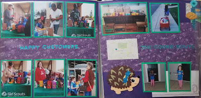
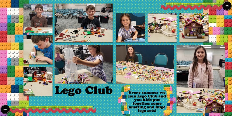
Basically its two layouts that coordinate through color and theme to create a unified effect, as opposed to two single layouts that stand alone. However, by treating facing pages in an album as one page (think of it as a 12x24 layout instead of just two 12x12s), you can create a large canvas to express the many aspects of your event. You can also add one larger eye-catching photo among the smaller photos for emphasis.

Master Builder lego legos legoes kids blocks blocko image 6

Of course, there are some tricks to DPSs that will help them look utterly amazing in your album, let's talk about one each month for the year of 2020.

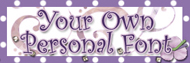
First, if you have too many photos to fit on a single page, a DPS allows you to spread out a little. They also allow more room for journaling. Be sure you are using your own handwriting, it is SO important, and you can turn your handwriting into a font HERE!

The main element tying your pages together, besides the photos, should be the papers. The matching background papers create a common color scheme and instantly tie the pages together. Plus, if you like to have the facing pages in your scrapbook match, creating a double-page spread is the perfect solution. When facing pages match, the overall effect creates a continuity that is nice to look at, rather than the sometimes jarring effect very dissimilar pages can have. Most of my scrapbooks have a color palette that I stick to, so even pages that are not DPS's still look nice next to each other in the album.

Be sure to subscribe to my blog so you don't miss next month's tip for making gorgeous DPSs!